Why change the old logo?
During the year it have become apparent that a new company logo was needed. The reason for this has been that the we didn’t really have a unified agreement over exactly what logo to use. Different versions of the old logo or just the company name appears here and there which in the end becomes very fragmented to say the least. So instead of just deciding on what version to use we took the opportunity to start fresh and create a new Bitcraze logo.
What is a logo?
Even though a logo can come in all colors and shapes or maybe just being a font or the company initials, it is important to understand that it is only one part of the company brand puzzle. The logo isn’t made to increase sales, win design awards or to get more customers, it is solely an identifier. Of course a nice side-effect could be increased sales but the purpose when creating a new logo should be to reflect the brand not to increase business. In stating that a logo is just an identifier doesn’t mean that it is unimportant or pointless to put any thought into the design process, on the contrary the branding of a company together with things like having clear company values are part of the core communication with the outside world.
What to consider
Creating a logo is a tricky task, the alternatives are literally infinite and the final decision of the new logo had to be something everybody in the team agrees and fell comfortable with. There is some basic consideration however that has been part of the discussion from the initial meeting. During the research phase I learned a few ground rules, I’m not sure they tell the whole story and there is certainly more considerations and angles to what makes a good logo, but I think in general they have worked as good guidance along the way. To illustrate these guidelines better I have used some examples from different more or less famous companies:
Simplicity:
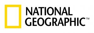
Keeping it simple has been a key aspect in the process of creating a new logo. Above is a great example of how to use a simple shape in combination with a distinct color and a specific typeface to create a logo.
Not just a cool shape but has meaning:
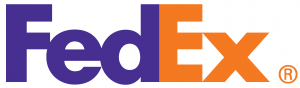
Besides a very clever way to incorporate a symbol in the company name the shape of an arrow (between the “E” and the “x”) also tells something about the company, that FedEx is on the “move”.
Works everywhere:
Phones, tablets, smartwatches or t-shirts it doesn’t matter the logo should be made so that it works anywhere. This often means that the logo can’t have to many details or be to complex.
Timeless:
If you are looking at creating a logo that last over time, it is important to design something that is independent of trends or a specific event. It all comes down to the context of why you are making the logo.
Not cliché
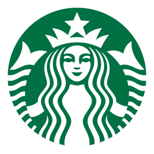
Just because you are selling coffee doesn’t mean that your logo should be a coffee cup, look at Starbucks they have a mermaid/siren as a logo. Using something that isn’t obvious can create interest and recognizability since it stands out among others.
Memorable:
There is two ways for a logo to be memorable, it can either be very simple and easy to remember or it can be engaging by making an impression of some sort.
One strong feature
Sticking to one strong feature keeps a logo clear and distinct. This has been a very important guideline during the process of making a new logo for Bitcraze, only keeping to one idea.
The design process
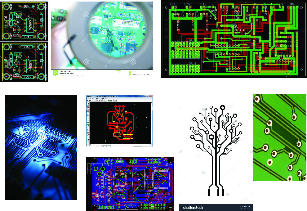
The design process have consisted of recurring workshops and iterations where different alternatives and suggestions have been weighed against each other. A great design tool during this time has been Mood boards, visually illustrating an idea using collages is a very effective way to explain the background or inspiration to a design concept. Without going to much into detail about the whole process here is the Mood board that later evolved into the final design.
Final design
So here it is the new logo :-).
The inspiration, as you can see comes from the vias on a PCB. The core concept here is the love for development and being a hardware company making bleeding edge technology. An obvious choice would have been making something connected to flying and drones but since Bitcraze is more then just a drone company we chose another path.
We did however keep “Quantico”, the techy looking font that we have been using as it creates a nice contrast to the new logo. We have also been discussing different ideas of how to incorporate the logo onto our PCB:s, it would be kind of cool to have an actual via going through the logo right :-)?
It feels super exciting and a bit relieving that we managed to boil it down to a final design that we really like, and we hope that our community will like it as well.
So please write a comment and tell us what you think!


